Client
Quarters Residential
Deliverables
Brand Identity
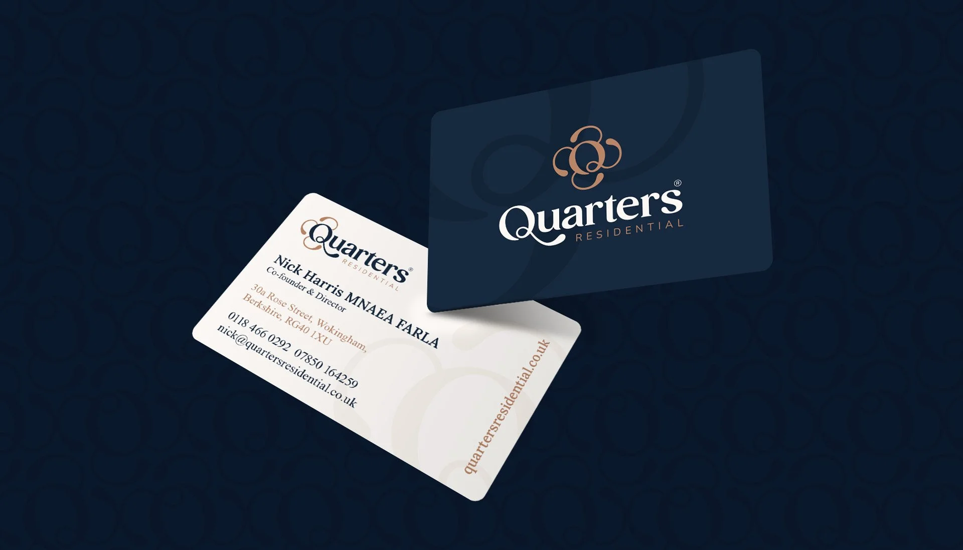
Stationery
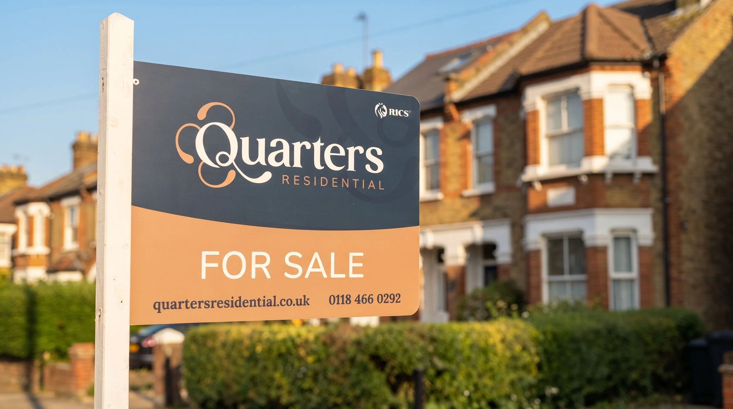
Sale boards
Newsletter template
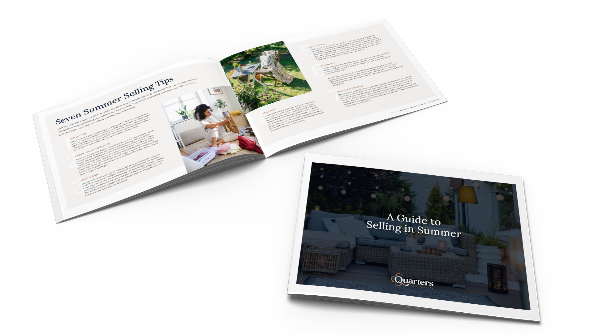
Brochures
A premium rebrand for Quarters Residential, built around a custom logo mark inspired by the brand's own initial.
This estate agent had an existing brand originally created in house. As the business grew, they wanted a rebrand that better reflected their premium positioning in the local market.
The existing branding no longer felt aligned with the business they'd become. The brief called for a new identity that captured a genuine sense of premium quality, while still feeling distinct and ownable within a competitive local market.
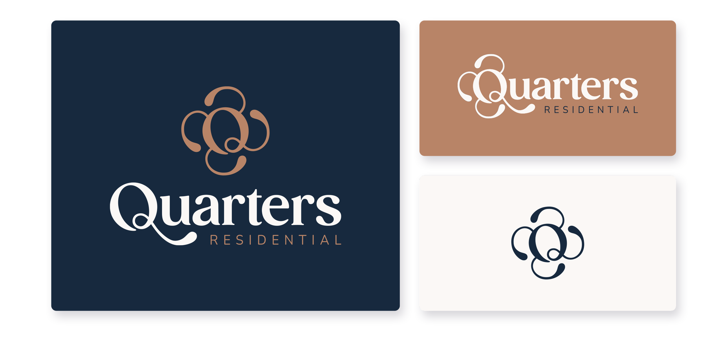
The brand mark was built around the letter Q, reimagined as a graphic of four interlocking components that subtly play on the brand name itself. Each element feels as though it's moving fluidly from one place to another, while staying connected to the central Q, reflecting how properties and people move seamlessly from one place to the next. The ornate, considered style helps to give the brand a distinct, premium feel.
A series of responsive logo variations was also created, ensuring the mark adapts cleanly across formats, from small digital icons to large scale signage.
Using the client's original brand colours as a starting point, I developed an elegant, timeless palette designed to reinforce the brand's premium feel. Blue and gold were established as the primary colours, complemented by a set of secondary tones that add further dimension and depth to the identity. Neutral tones were introduced to provide a calm backdrop, helping to balance the boldness of the primary palette and ensuring the brand felt sophisticated rather than overpowering.
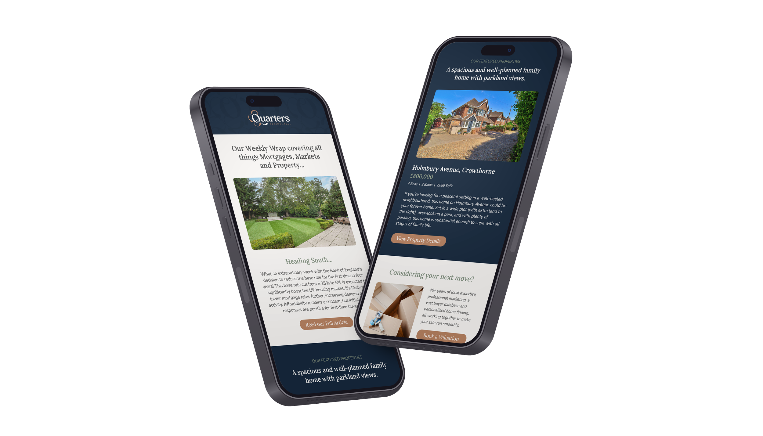
The new identity was rolled out across a full suite of brand touchpoints, including business cards, sale boards, brochures, social media assets, and an email newsletter template. Each application was designed to carry the same sense of premium consistency, from the first impression of a sale board on the street through to the follow up details shared in a brochure or newsletter.
The client loved the rebrand, with the new identity giving Quarters Residential a distinct, premium presence that properly reflects the quality of service they offer across every touchpoint, from the high street to their digital marketing.
You may also like
You may also like

Social Sixth
Brand Identity
Burrito Bonito
Brand Identity