Client
Burrito Bonito
Deliverables
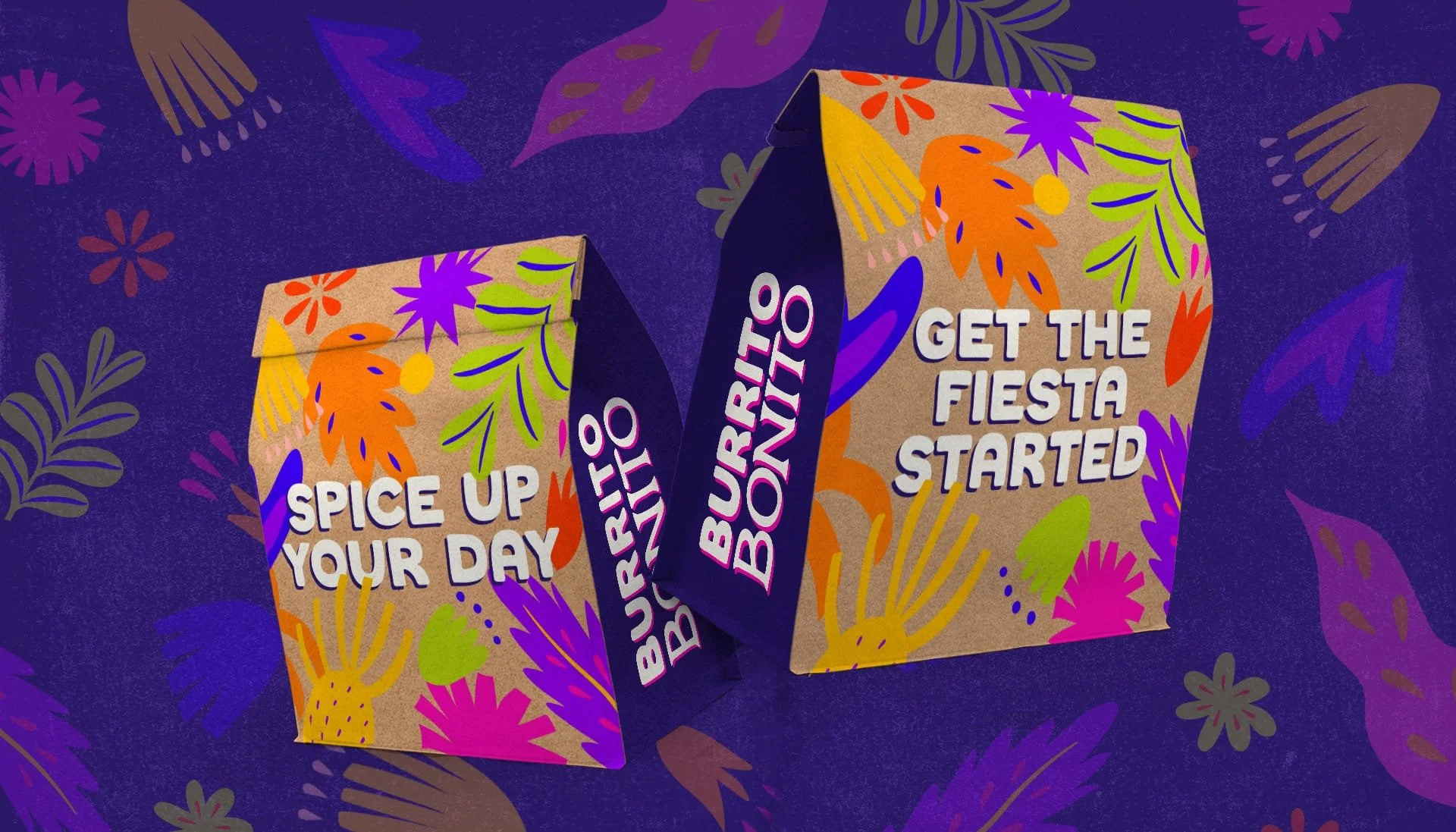
Brand identity
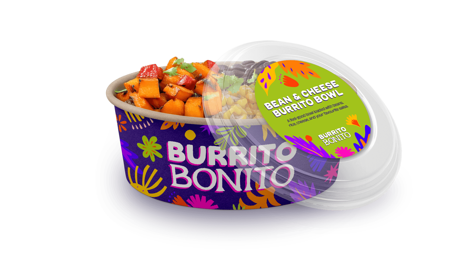
Packaging
POS
Interior signage
A full brand identity for a Mexican quick-serve concept at King's Cross Station, built around the hand-painted artistry of traditional Mexican signage.
Burrito Bonito is a Mexican quick-serve restaurant concept based at King's Cross Station, serving authentic dishes like burritos and quesadillas throughout the day to busy commuters. The brief called for a full brand identity, spanning logo, packaging and POS designs.
Positioned within one of London's busiest transport hubs, the concept needed to work hard in a fast-paced, high-footfall environment, while still feeling authentically Mexican rather than a diluted, commuter-friendly version of the cuisine. The challenge was to create a brand that could stop someone mid-rush, while staying true to genuine Mexican culture and craft.
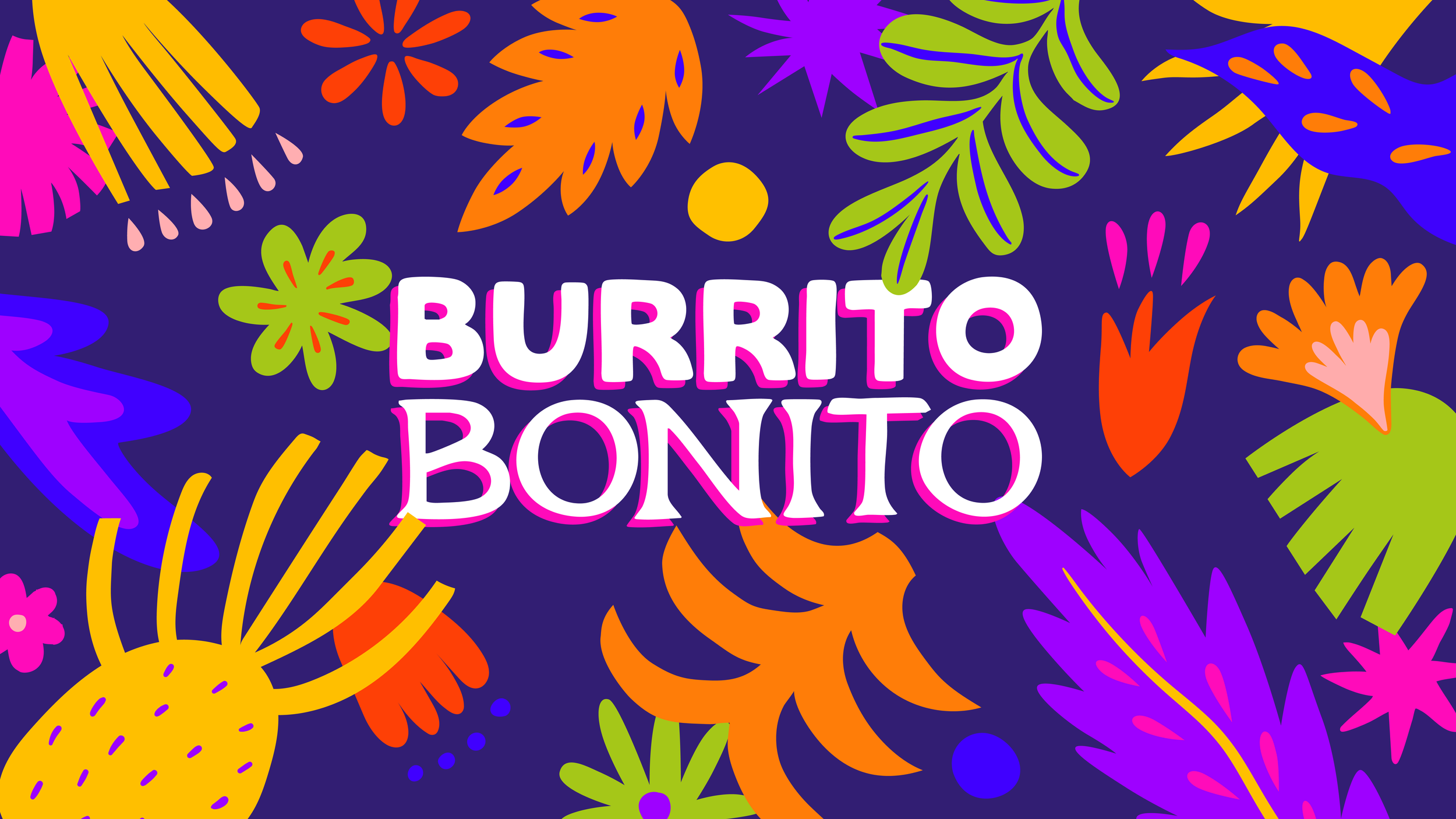
The rationale centred on celebrating the rich culture of Mexico: drawing from the vibrant artistry of handcrafted alebrijes (brightly coloured folk-art creatures), the bold colours of traditional rótulo signs (hand-painted Mexican shop signs), the festive flair of papel picado, and the natural beauty of Mexican flora. Just as rótulos are lovingly hand-painted by skilled artisans, the idea was that every dish at Burrito Bonito should feel crafted by hand, with the same care and boldness. The brand line is: eat bold, live vibrantly.
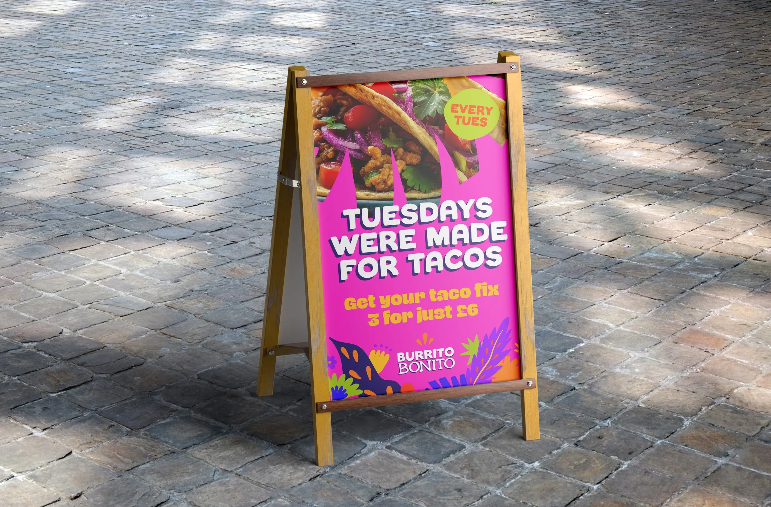
I began by researching traditional Mexican sign painting, alebrije artistry, and papel picado patterns, looking for authentic visual references rather than a more generic, stereotyped take on Mexican design. From there, I developed a bold colour palette and hand-painted typography, inspired directly by rótulo signage, to give the brand a genuinely crafted, artisanal feel rather than a purely digital one.
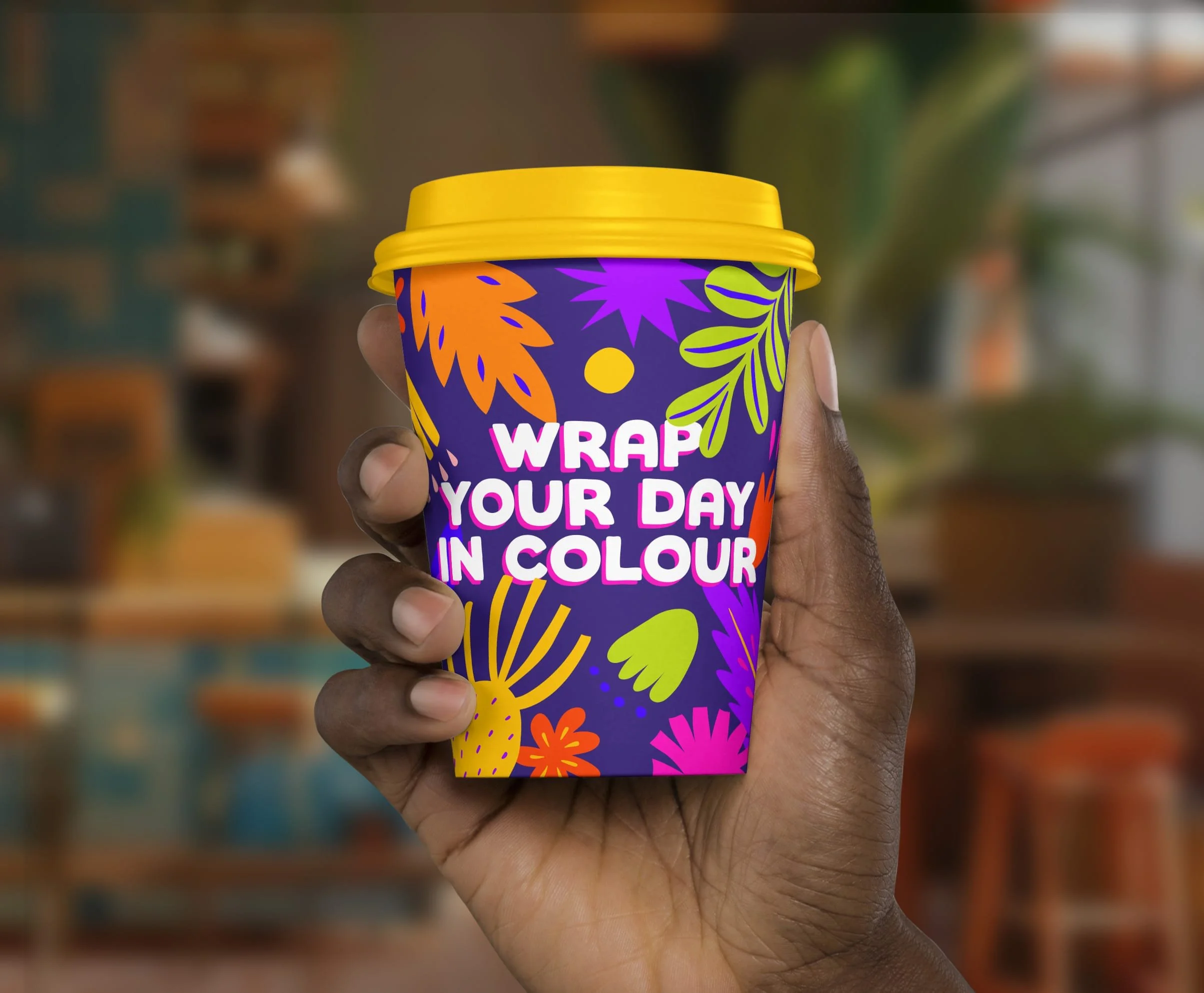
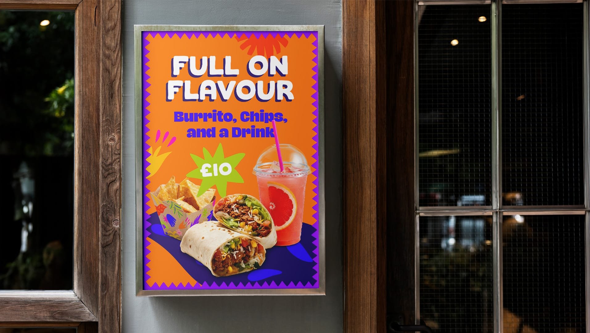
The logo was entirely hand-drawn, echoing the loose, confident brush strokes of traditional hand-painted rótulos, and paired with a custom hand-drawn font created specifically for the brand to carry that same artisanal quality consistently across every touchpoint. This was combined with a vibrant colour palette drawn from traditional Mexican textiles and signage, along with papel picado inspired patterns used throughout the branding to add a playful, distinctive character. Together, these elements helped reinforce the brand's core idea: that every part of it, from the branding to the food itself, was made with genuine care and craft.
You may also like
You may also like
Social Sixth
Brand Identity
Quarters Residential
Brand Identity