Client
Krispy Kreme
Deliverables
UI design
UX consideration
Lottie animations
Figma component library
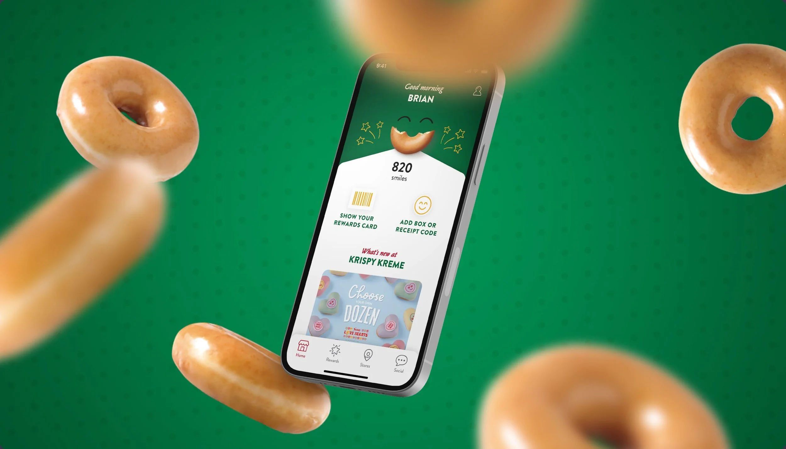
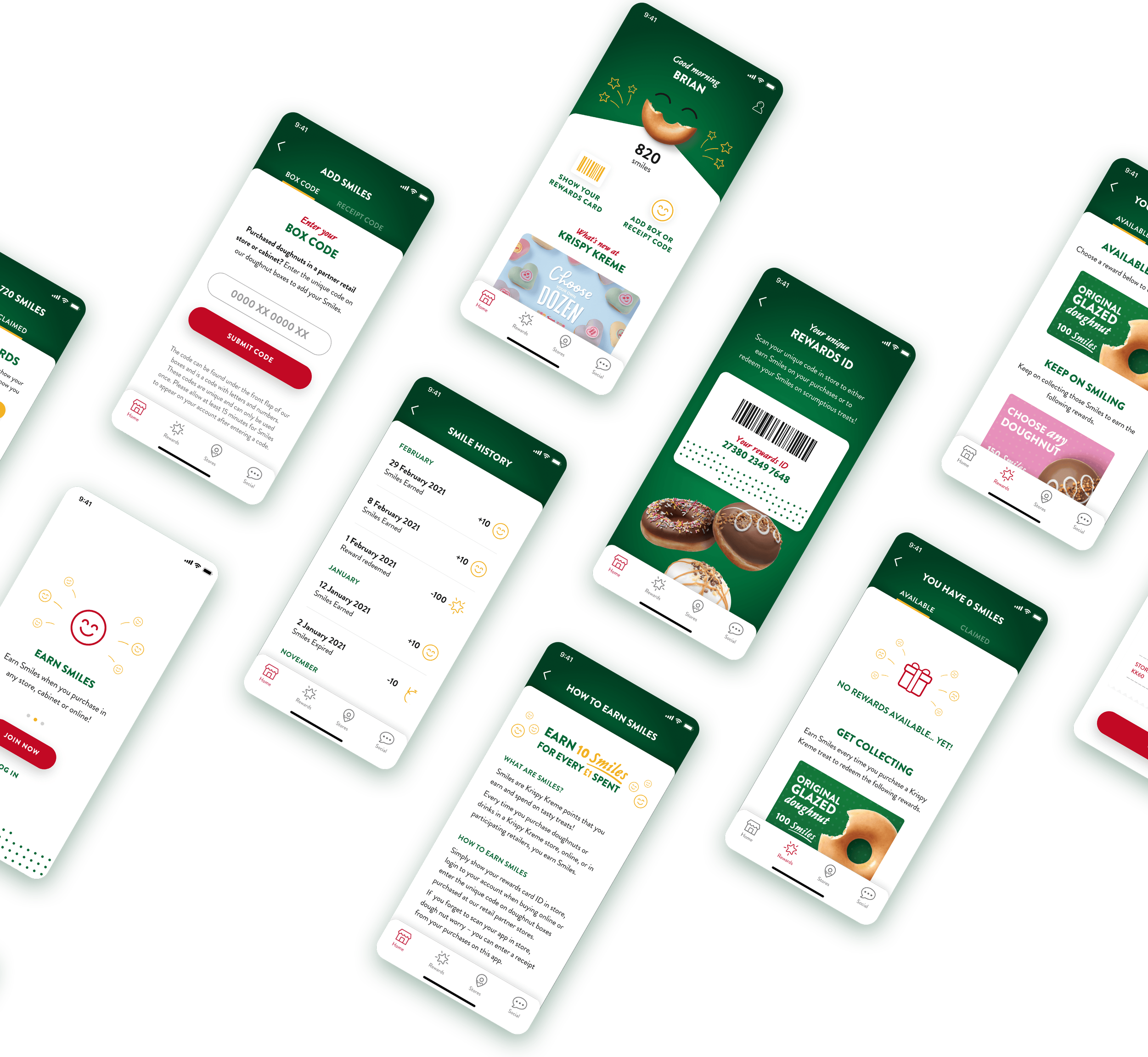
An updated UI for the existing Krispy Kreme rewards app, designed to improve usability and better reflect the brand’s personality.
Working in close collaboration with an external development team, I led the UI design and streamlined the UX to make the app more intuitive and engaging for users.
These changes helped increase customer satisfaction with the app, lifting the App Store rating from 1.9 to 4.7.
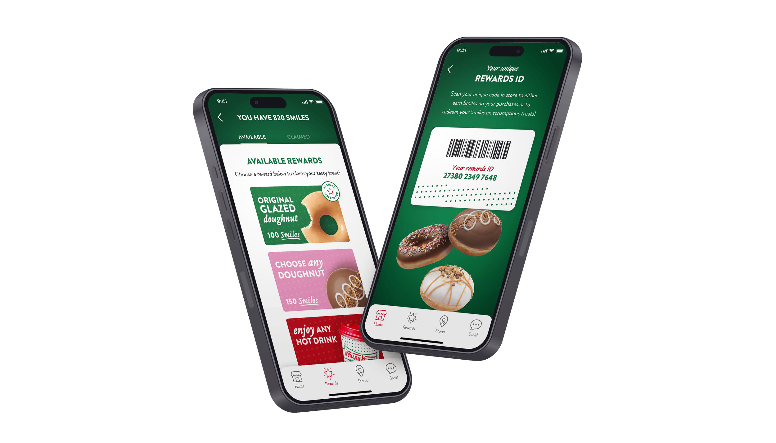
The existing app was functional, but sterile. It did the job, but didn't feel like Krispy Kreme. While the majority of the app's core functionality was fixed, there was an opportunity to improve the experience around it by simplifying access to key actions like checking a Rewards ID, adding points from purchases and bringing more of the brand's personality into the interface itself.
Existing app design
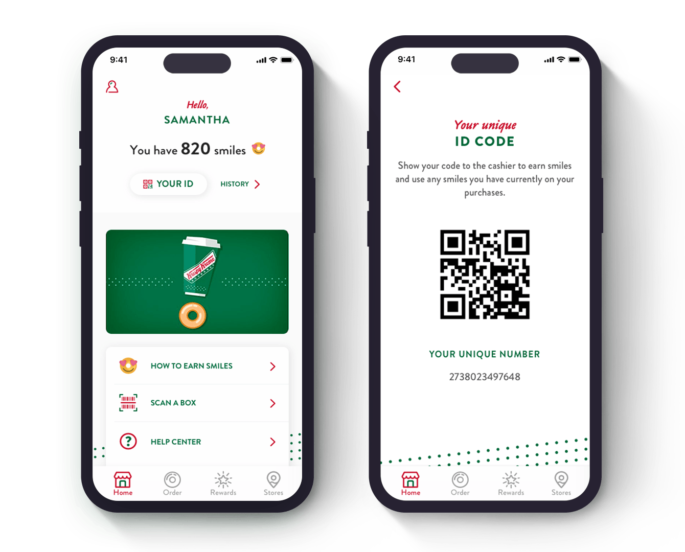
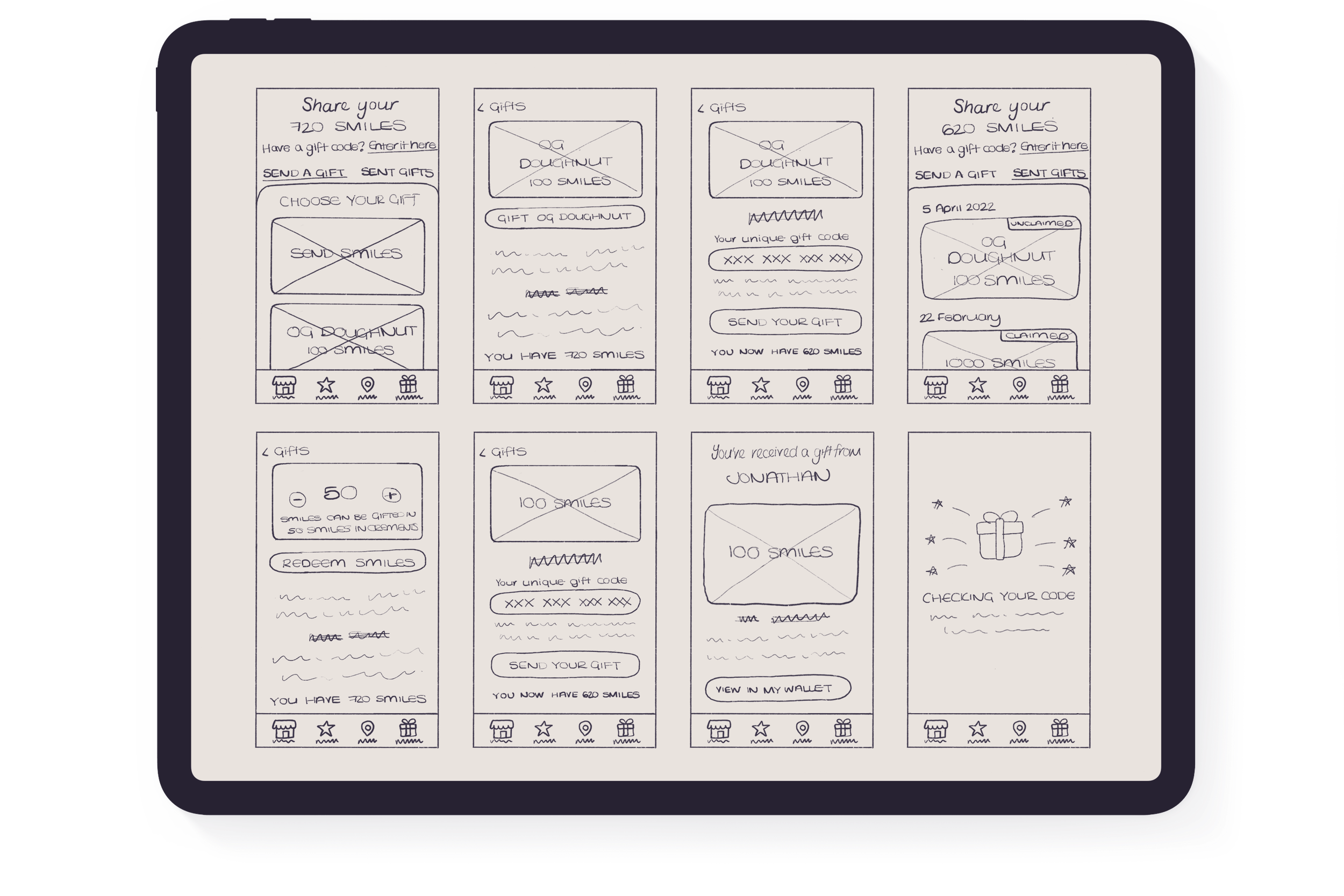
I started with wireframes to facilitate discussions with both the client and the development team, focusing on addressing the app's main pain points within the existing structure. This stage also included planning new functionality, including the ability for users to gift their reward points to someone else, while working within the constraints of the current app architecture.
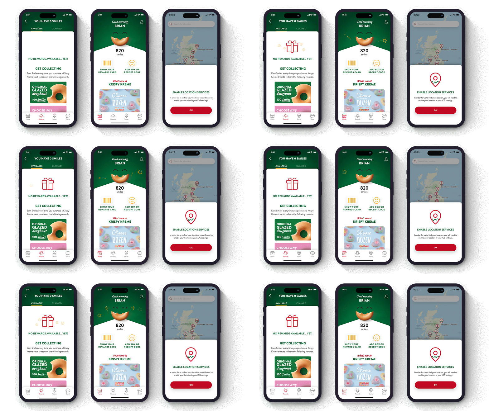
To bring some joy back into the experience, I designed and animated a set of Lottie animations in After Effects, used across the onboarding screens, landing page, confirmation screens, and empty states. I also redesigned the landing page and added a remotely managed promo area, giving the marketing team the ability to update and highlight campaigns without needing a new app release.
You may also like
You may also like
Insomnia Cookies
Print Design
The Little Sweethearts
Responsive Website