Client
The Little Sweethearts
Deliverables
Brand Identity
Wireframes
UI design
Website build
A fun, functional site built to grow with the nursery, and easy for staff to manage themselves.
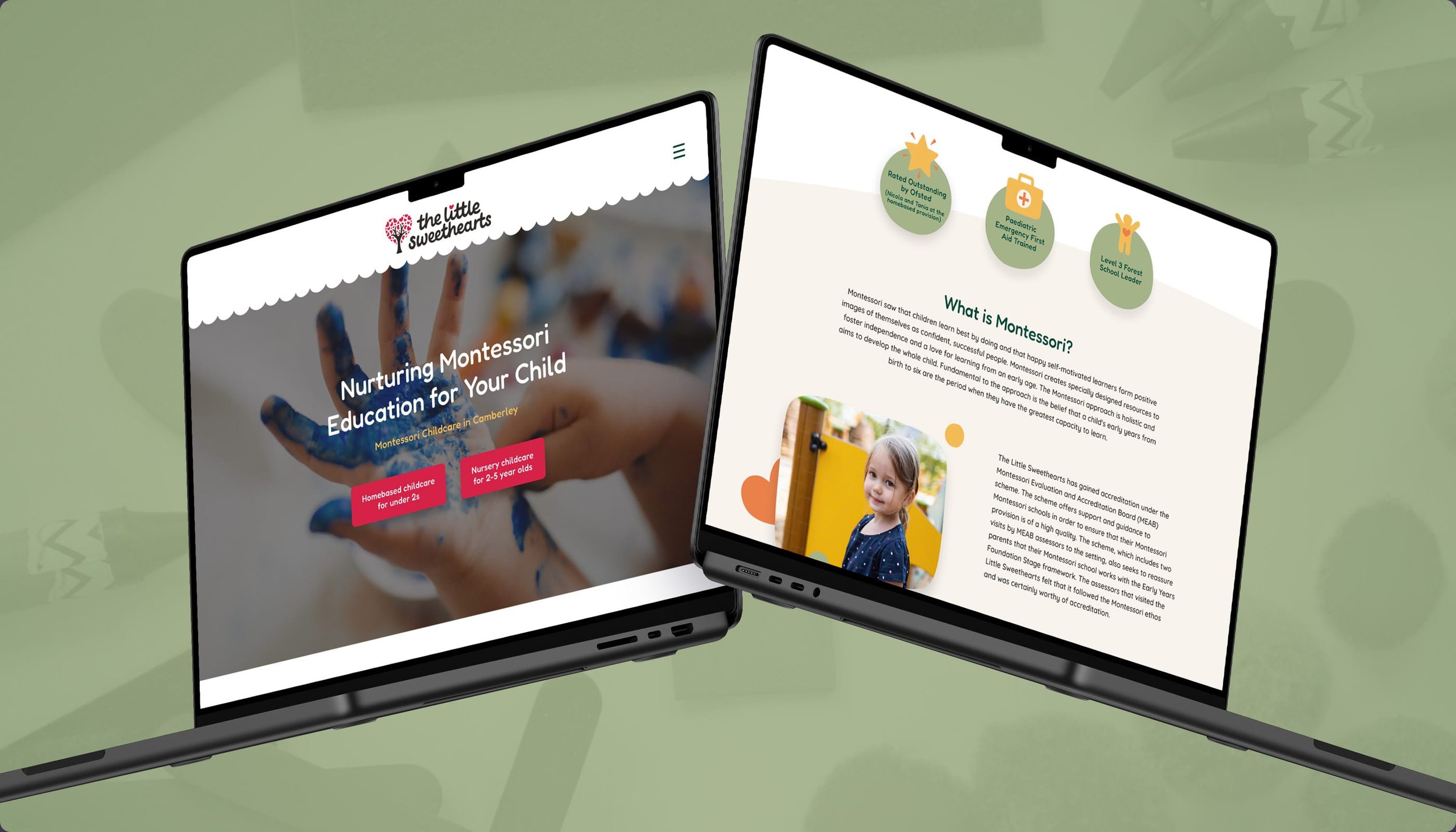
The existing website for The Little Sweethearts was outdated and no longer fit for purpose, especially following the nursery's recent expansion to a second location. It was also hard coded, meaning staff had no way to update it themselves.
Considering the pain points for both existing and prospective parents, I designed a site that felt fun and welcoming, while remaining genuinely functional. It was built in Wix, giving nursery staff the ability to make updates as needed, without relying on a developer.
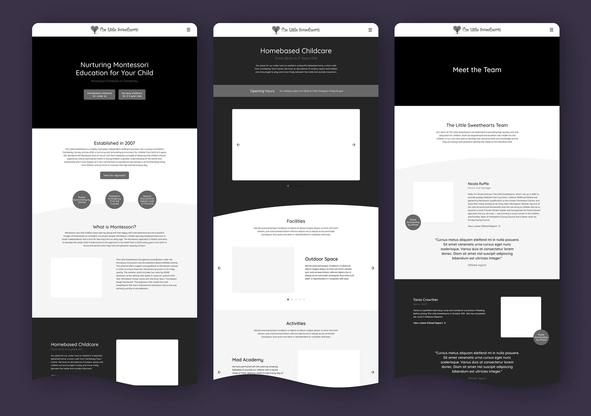
Before designing the site, I created a wireframe prototype outlining each page. With the nursery now spanning two locations, each catering to a different age group, making this distinction clear to prospective parents from the outset was a key challenge to solve for.
To reduce the number of email enquiries staff were handling day to day, I proposed an FAQ page covering the most common questions. A "Meet the Team" page was also added, featuring photos and short bios for each staff member, to help put new and prospective parents at ease before they'd even visited in person.
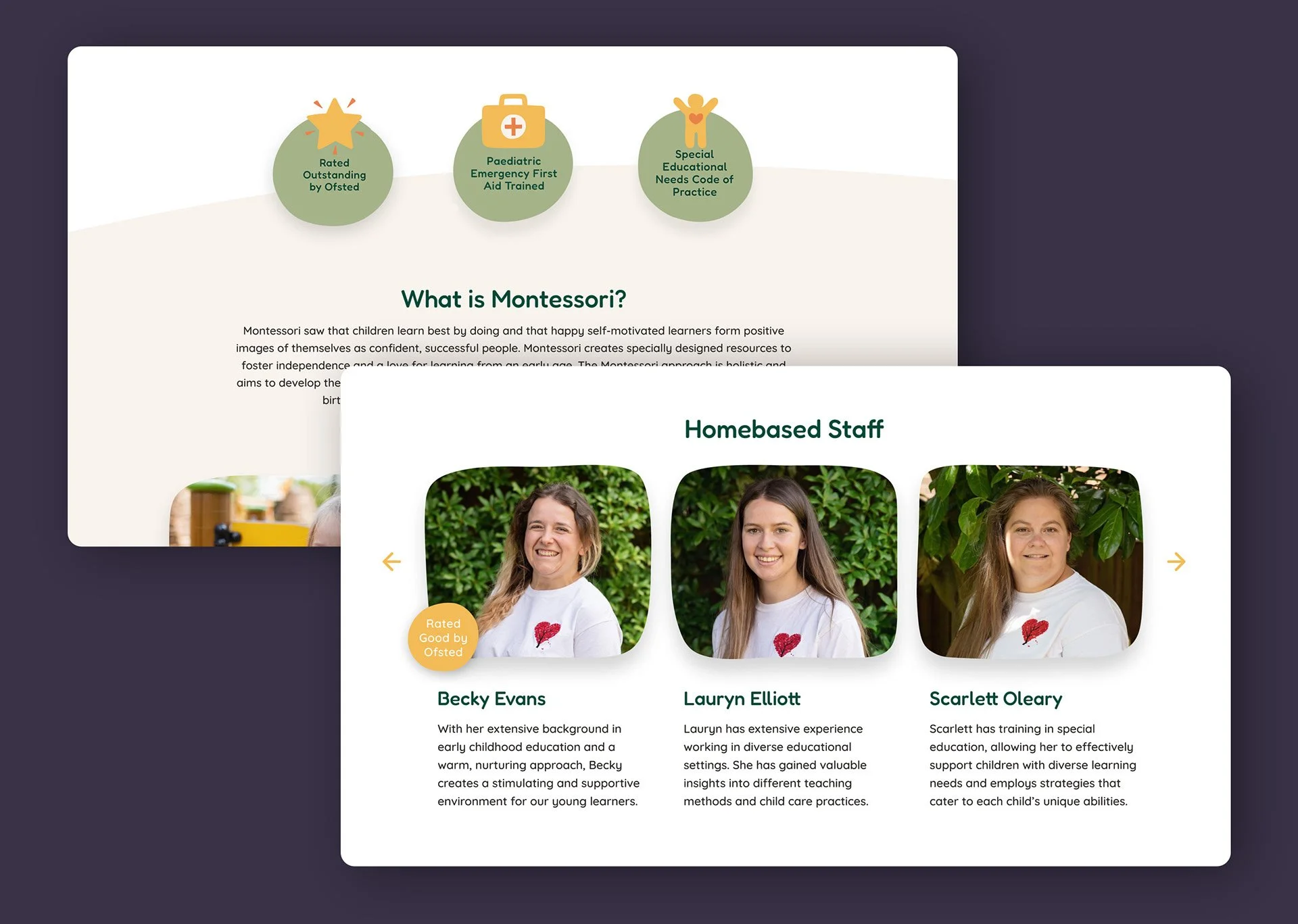
Throughout the design, hand drawn elements and shapes were used to bring a sense of warmth and playfulness, paired with subtle micro interactions to make the site feel engaging without tipping into childish. Since parents, not children, are the ones actually browsing the site, striking that balance was central to the design.
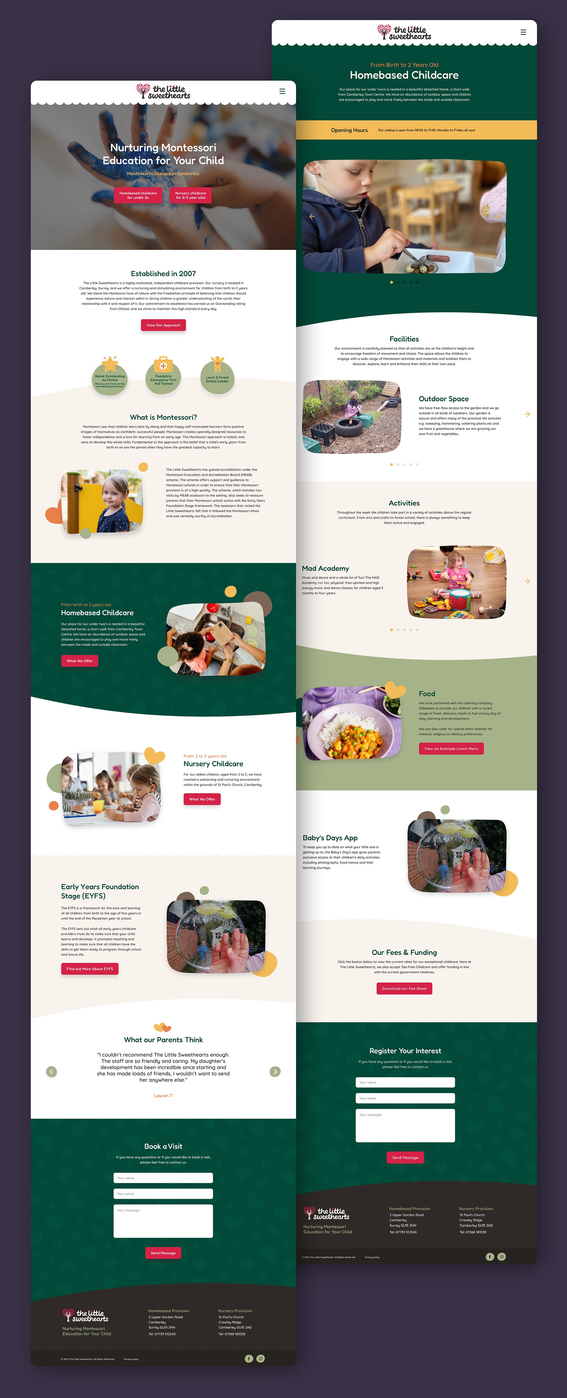
Since launch, routine email enquiries have dropped by 40%, thanks in large part to the new FAQ page answering common questions upfront. Site traffic has also grown by at least 60% with prospective parents able to find the information they need more easily across both locations.
You may also like
You may also like
Krispy Kreme
Rewards App

John Lewis
Email Campaigns